The Top 8 Home Design Trends in 2018
Maximalism heads back, florals get bolder, and closets become more Instagram-friendly


It’s nearly 2018. And, as another year changes, so do the home design and decor trends, naturally.
Whether you’re looking to overhaul your home entirely, or just give it a few fresh updates, here’s a guide to the hottest looks, courtesy of the design pros. Major inspiration ahead.

A master suite sitting room designed by Sea Pointe Construction showcases varied metals and finishes to create a rich multi-dimensional effect.
Photography Courtesy of Sea Pointe Construction
Modern Maximalism
If you thought 2017 was the year of minimalist living, 2018 will be basically the opposite. “The ’80s maximalist trend is back in a big way,” said Christine Markatos Lowe of Christine Markatos Design in Santa Monica, California.
“We’re seeing more pieces and more colors and more mixing of patterns to create a purposefully over-decorated look,” she said. “The days of finding pieces of provenance with rich history have fallen to the wayside, making room for more whimsical, of-the-moment decor.”
Examples include layering different rugs, using bright colors and bold patterns not only for pillows and accessories but for larger furniture pieces, and decorating with bold-on-bold accents such as wallpaper and rugs in the same space.
Another way this type of décor is playing out is through mixed media finishes. “People are mixing metals, textures, and sheen,” said Mitchell Parker, an editor with Houzz, an online platform for home remodeling and design. “Think shiny brass light fixtures mixed with a matte black steel chair or table legs, or a glossy honed countertop.”
One place to experiment with this look is curtain hardware. For example, a polished nickel rod with brass rings. “We’ve also been seeing this trend in kitchens where the cabinet hardware, plumbing fixtures, and lighting are done in a variety of finishes ranging from brass and nickel to oil-rubbed bronze, which lends a more modern look than just sticking to one metal finish per room,” Ms. Markatos said.
For those who are less bold, a subtler option to try is one finish for the attached fixtures in a room, such as the lighting or hardware, and then mixing in a contrasting finish for accent pieces like a bench or table lamp.
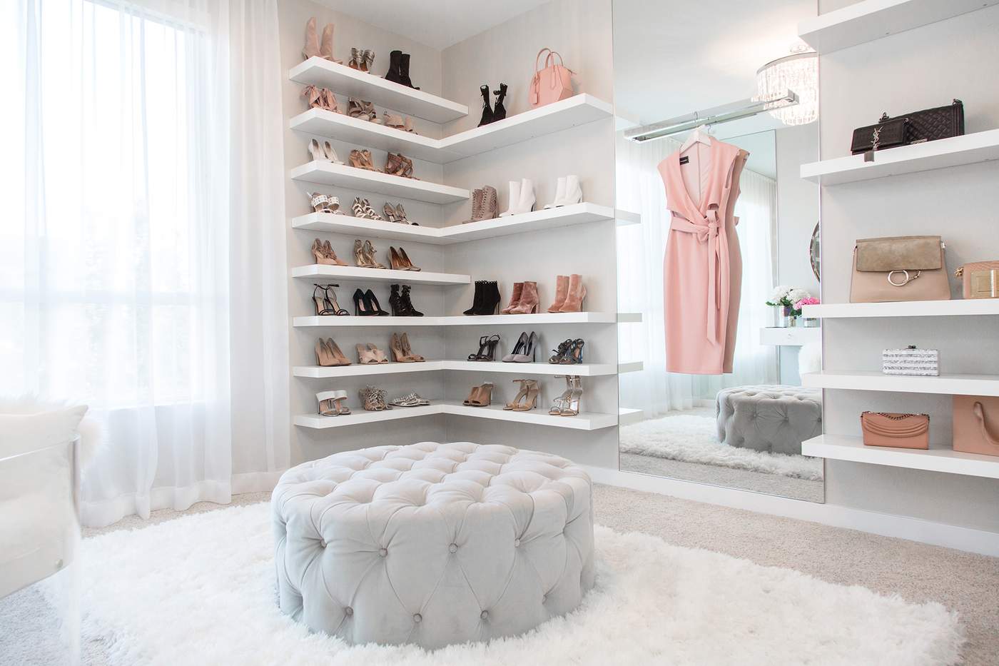
This walk-in closet designed by Lisa Adams of LA Closet Design features a chic staging area that’s social media ready.
Photography Courtesy of LA Closet Design
Closet Overhauls
“To meet the on-the-go needs of clients, we’re incorporating areas for charging and changing all the essentials when switching handbags,” said Lisa Adams of LA Closet Design in Los Angeles. These purse “changing stations” include inserts for pens, paper, and electronics for the busy woman who constantly changes accessories, or the on-the-go professional who carries her workspace with her, Ms. Adams said.
Staging areas in closets are another big trend. “As social media becomes an increasingly present part of our style choices, staging areas need to not only function well for creating looks, but also must be beautifully designed to showcase new looks and share them across social channels,” Ms. Adams said.

Layered rugs and a blend of colors, materials, and finishes add depth and dimension to a bedroom designed by Donna Mondi.
Photography by Nick Novelli, Courtesy of Donna Mondi Interior Design
One-dimensional effects have given way to more complex designs with varied materials. “I’m seeing more complexity in furniture that incorporates multiple materials to create more interest,” said Donna Mondi, founder and principal, Donna Mondi Interior Design in Chicago. “For example, in our capsule collection, the floor mirror has a steel surround, mirrored face, leather corners, and brass accents, and our vanity chair is a combination of wooden legs, brass ferrules, and mohair fabric. Combining elements in interesting ways makes the furniture so much more dynamic and decadent,” she said.
Sophie Paterson of Sophie Paterson Interiors in London noted that heavily textured beaten metals in antique brass and bronze paired with surfaces such as natural stone and exotic wood veneers are becoming more popular. “We use a lot of stone and metal for freestanding pieces such as consoles, coffee tables, and side tables,” she said.

Designed by Jeffrey Beers, this bedroom in One West End in Manhattan features a funky geometric printed wallpaper that adds interest and a point of view.
Evan Joseph for One West End
Wallpaper 2.0
Today’s options are not your great-grandma’s variety.
“Wallpaper has reached new heights of coolness with digitally printed papers that are being produced by small boutique wallpaper companies,” Ms. Markatos said. “The design options are endless with really saturated colors and unique motifs that you just can’t find in the more traditionally produced papers. ...Their impact can be great when used in a small space like a powder room or entryway.”
In fact, Jeffrey Beers of Jeffrey Beers International in New York is currently collaborating on his first wallpaper collection. “We are moving away from neutral and monochromatic interiors and heading toward colors and patterns that speak to individuality and emotions,” Mr. Beers said. “Patterned and colorful wallpaper is an excellent way to show your unique style, as well as add warmth and texture to a space.”
Ms. Paterson is finding her clients are gravitating toward more textural papers, such as silk, grasscloth, and tasteful vinyls, as well as more statement patterns like elaborate Chinoiserie hand-painted wallpapers for accent walls like headboards, as well as entire dressing rooms.

A cerused wood dresser currently available from West Elm.
Cerused Wood Finishes
A technique developed centuries ago, cerusing uses a white pigment to fill in and reveal the unique grain lines of wood. “Designers are opting for cerused finishes because of the interesting texture that is created by the process,” Ms. Mondi said. “With a resurgence of heavily grained oak there was a desire to find new finishes for a fresh approach,” she said. Today’s cerusing is created with nontoxic waxes that whiten the finish—similar to limed oak. It’s being used on everything from natural to black stains on cabinetry and furniture. “The effect can be as dramatic as an entire kitchen or as simple as a touch for the feet on sofas or chairs,” Ms. Mondi said.
“Cerused wood is my current go-to finish for bases of tables, frames of chairs, bedside tables, and built-ins,” said U.S. and London-based designer Birgit Klein of Birgit Klein Interiors. “The tendency for so long was toward sleek, elegant lacquer, which I still love, but I think people are craving more natural elements and materials.”
“Since cerusing wood reveals the natural grain, it adds an organic element to a room, but in a very modern way especially since it is being done in new finishes like oak washes and greige finishes,” she said.
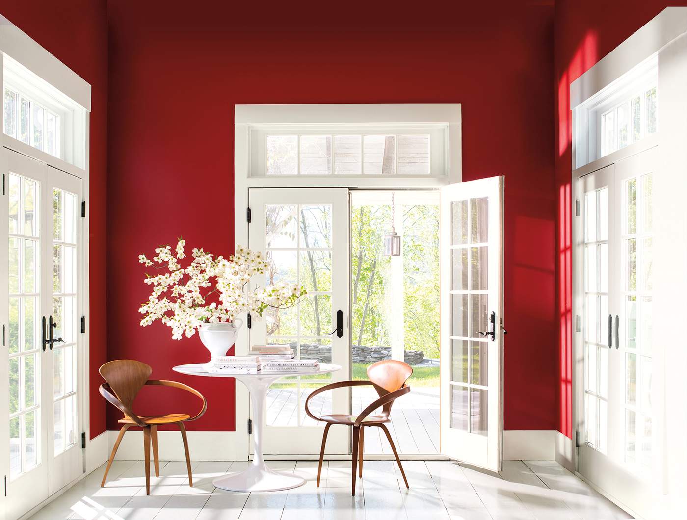
According to Andrea Magno, the hottest hue for homes in 2018 is a bold, vibrant red shown in this sunroom.
Photography Courtesy of Benjamin Moore
Saturated Hues
Neutral tones are giving way to bolder, more vibrant hues, which take their cue from Pantone’s Color of The Year for 2018, Ultra Violet, a vivid shade of purple. Other jewel tones such as emerald green, rich amethyst purple, indigo blue, and mustard yellow, are also gaining popularity, Ms. Klein said. “Rich, saturated jewel tones are at the opposite end of the color spectrum from the neutrals we have seen time and time again, and I think these hues are a welcome change.”
These bolder shades are mostly expressed as pops of color in a room. “Smaller winks of color are being used in primarily neutral rooms, adding just a gesture of color and personality to liven up the space,” Ms. Magno said. An accent can be achieved through painted millwork, the edge of a window frame, a small area rug, or piece of furniture in a bold hue.
Ms. Paterson is also incorporating more jewel tones. “We’re using a predominantly neutral base and then adding accents of amethyst purple or emerald green into a key piece of the upholstery, cushions, lamps, art, and accessories,” she said.
Mr. Beers said he and his team utilize pops of color through objects such as a hand-blown glass vase or striking pieces of artwork, “to add a sense of wonder and intrigue into a space.”
“After so many years of grey and greige, the design world was ready for saturated colors in exciting hues,” Ms. Mondi said. “Neutrals can easily be mixed in to make this a trend that is relatively simple to transition to.”
As a nod to this trend toward more saturated shades, Benjamin Moore announced its Color of the Year 2018 as Caliente AF-290, a vibrant shade of red, as well as their 2018 palette consisting of a variety of reds, from hints of blush to rich and earthy crimson. “Caliente AF-290 is a bold and confident red, but it’s also quite classic and can be used in different spaces from a study or library, to a powder room or a front door,” said Andrea Magno, a Benjamin Moore color and design expert, based in New Jersey.

Dining room chairs decked in an abstract floral print lend a whimsical vibe to this room designed by The Novogratz.
Photography by Costas Picadas
Floral Persuasion
Lately, everything is coming up roses and peonies and lilacs. Splashes of over-sized blooms and large-scale florals with botanical references in wall art and furniture have been gaining prominence in interior design, Mr. Parker said.
“An oversized abstract floral is a fresh and modern take on the smaller-scale chintzes that are typically viewed as more traditional and stodgy,” Ms. Klein said. “When used as curtains or on walls, this bold-scale pattern doesn’t shy away from making a statement.”
Think dark, large-scale floral wallpaper in a powder room with a subtly striated marble countertop, faceted crystal sconces, and antique gold fixtures—and a typically mundane bathroom becomes a conversation piece. “The grand scale of an oversized abstract floral pattern really takes commitment, but the risk is worth the reward,” Ms. Klein said.
Florals are definitely trending, says Los Angeles-based designer Cortney Novogratz of The Novogratz. Whether you decide to go over the top and bold, or keep the floral pattern simple, don't be afraid to add pattern into your space. “We recently re-covered a client's dining room chairs with a whimsical floral that's still understated and elegant,” she said.

Designed by Sophie Paterson, this home in the The W1 London features Art-Deco inspired shagreen finishes and a blend of gold and brass architectural light fixtures and wall sconces.
Photography Courtesy of W-One International
Art-Deco Inspired
What’s old is new again. The glamour of Art Deco-inspired décor and design is spreading through both residential and commercial projects. Ms. Paterson has seen the influence in architectural detailing such as coffered ceilings and bronze-framed windows, and in exotic veneers and luxurious materials such as shagreen and metal inlays.
For a recent project for the The W1 London, which has retained its original Art Deco facade, Ms. Paterson decorated the interiors with fan and geometric motif fabrics as well as furnishings, including a tub armchair that echo the Art Deco design era. The trend is also playing out in the way of metallic finishes, such as brushed and shiny gold vintage inspired light fixtures.
Photo Top: A child’s room designed by Jeffrey Beers showcases vibrant blankets, which come alive against an otherwise neutral palette.
Photography by Evan Joseph for One West End